
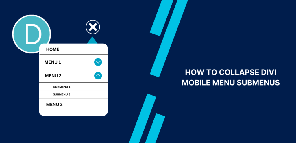
The Divi theme offers a multitude of customization options, but one feature that is not available by default is the ability to collapse the menu items in the mobile menu. However, fear not! We are here to guide you through the process of making your Divi menu collapsible and stylish.
In this tutorial, we’ll guide you through the best and easiest method to achieve this functionality while enhancing the visual appeal with stylish toggle icons. This tutorial perfectly complements our other Divi Menu tutorials, enabling you to create a stunning and fully functional Divi mobile menu. Get ready to take your website’s mobile navigation to the next level!
Adding jQuery to Collapse Divi Mobile Menu Submenus:
The objective is to transform the default expanded list of the Divi mobile menu into an attractive and compact format. We will accomplish this by incorporating jQuery and CSS code. Not only will this collapse the mobile Divi menu submenus, but it will also introduce visually pleasing toggles to guide users and indicate the presence of additional menu items. This tutorial consists of two parts, each focusing on a specific code type. Both parts are essential for seamless functionality.
If you are using our free Divi child theme, insert the following snippet into the scripts.js file and remove the <script> tags from the beginning and end. Alternatively, place the code in your Divi > Theme Options > Integrations tab within the “Add code to the < head > of your blog” code area.
<script>
    jQuery(function($) {
        $(document).ready(function() {
            $("body ul.et_mobile_menu li.menu-item-has-children, body ul.et_mobile_menu li.page_item_has_children").append('<a href="#" class="mobile-toggle"></a>');
            $('ul.et_mobile_menu li.menu-item-has-children .mobile-toggle, ul.et_mobile_menu li.page_item_has_children .mobile-toggle').click(function(event) {
                event.preventDefault();
                $(this).parent('li').toggleClass('dt-open');
                $(this).parent('li').find('ul.children').first().toggleClass('visible');
                $(this).parent('li').find('ul.sub-menu').first().toggleClass('visible');
            });
            iconFINAL = 'P';
            $('body ul.et_mobile_menu li.menu-item-has-children, body ul.et_mobile_menu li.page_item_has_children').attr('data-icon', iconFINAL);
            $('.mobile-toggle').on('mouseover', function() {
                $(this).parent().addClass('is-hover');
            }).on('mouseout', function() {
                $(this).parent().removeClass('is-hover');
            })
        });
    });
</script>
Adding CSS to Collapse Divi Mobile Menu Submenus
Next, we need to apply the corresponding CSS code, which complements the jQuery implementation and ensures the desired collapsed effect for the Divi mobile menu.
If you are using our free Divi child theme, insert the following snippet into the style.css file. Otherwise, include it in your Divi > Theme Options > Custom CSS code box. If you require assistance, consult our comprehensive guide on Where to Add Custom Code in Divi.
/* Changing hamburger icon to an "X" when the mobile menu is open */
#et_mobile_nav_menu .mobile_nav.opened .mobile_menu_bar::before,
.et_pb_module.et_pb_menu .et_mobile_nav_menu .mobile_nav.opened .mobile_menu_bar::before {
content: '\4d';
}

/* Adjusting the newly added toggle element through jQuery */
ul.et_mobile_menu li.menu-item-has-children .mobile-toggle,
ul.et_mobile_menu li.page_item_has_children .mobile-toggle,
.et-db #et-boc .et-l ul.et_mobile_menu li.menu-item-has-children .mobile-toggle,
.et-db #et-boc .et-l ul.et_mobile_menu li.page_item_has_children .mobile-toggle {
width: 44px;
height: 100%;
padding: 0px !important;
max-height: 44px;
border: none;
position: absolute;
right: 0px;
top: 0px;
z-index: 999;
background-color: transparent;
}

/* Ensuring proper positioning of elements */
ul.et_mobile_menu>li.menu-item-has-children,
ul.et_mobile_menu>li.page_item_has_children,
ul.et_mobile_menu>li.menu-item-has-children .sub-menu li.menu-item-has-children,
.et-db #et-boc .et-l ul.et_mobile_menu>li.menu-item-has-children,
.et-db #et-boc .et-l ul.et_mobile_menu>li.page_item_has_children,
.et-db #et-boc .et-l ul.et_mobile_menu>li.menu-item-has-children .sub-menu li.menu-item-has-children {
position: relative;
}

/* Removing default background color from menu items with submenus */
.et_mobile_menu .menu-item-has-children>a,
.et-db #et-boc .et-l .et_mobile_menu .menu-item-has-children>a {
background-color: transparent;
}

/* Hiding submenus by default */
ul.et_mobile_menu .menu-item-has-children .sub-menu,
#main-header ul.et_mobile_menu .menu-item-has-children .sub-menu,
.et-db #et-boc .et-l ul.et_mobile_menu .menu-item-has-children .sub-menu,
.et-db #main-header ul.et_mobile_menu .menu-item-has-children .sub-menu {
display: none !important;
visibility: hidden !important;
}

/* Showing submenus when toggled open */
ul.et_mobile_menu .menu-item-has-children .sub-menu.visible,
#main-header ul.et_mobile_menu .menu-item-has-children .sub-menu.visible,
.et-db #et-boc .et-l ul.et_mobile_menu .menu-item-has-children .sub-menu.visible,
.et-db #main-header ul.et_mobile_menu .menu-item-has-children .sub-menu.visible {
display: block !important;
visibility: visible !important;
}

/* Adjusting toggle icon position and transparency */
ul.et_mobile_menu li.menu-item-has-children .mobile-toggle,
.et-db #et-boc .et-l ul.et_mobile_menu li.menu-item-has-children .mobile-toggle {
text-align: center;
opacity: 1;
}

/* Styling the submenu toggle icon when closed */
ul.et_mobile_menu li.menu-item-has-children .mobile-toggle::after,
.et-db #et-boc .et-l ul.et_mobile_menu li.menu-item-has-children .mobile-toggle::after {
top: 10px;
position: relative;
font-family: "ETModules";
content: '\33';
color: #00d263;
background: #f0f3f6;
border-radius: 50%;
padding: 3px;
}

/* Styling the submenu toggle icon when open */
ul.et_mobile_menu li.menu-item-has-children.dt-open>.mobile-toggle::after,
.et-db #et-boc .et-l ul.et_mobile_menu li.menu-item-has-children.dt-open>.mobile-toggle::after {
content: '\32';
}

/* Adding a point on top of the menu submenu dropdown */
.et_pb_menu_0.et_pb_menu .et_mobile_menu:after {
position: absolute;
right: 5%;
margin-left: -20px;
top: -14px;
width: 0;
height: 0;
content: '';
border-left: 20px solid transparent;
Conclusion
In conclusion, mastering the art of collapsing Divi mobile menu submenus is crucial for creating a seamless user experience. By implementing this technique, you can optimize your website’s navigation on mobile devices, ensuring easy access to submenus without overwhelming users. At WPGuiders, we specialize in DIVI Website design and can help you incorporate this feature effortlessly. Enhance user satisfaction, streamline navigation, and elevate your online presence with our expert assistance. Don’t miss out on the opportunity to provide a user-friendly mobile experience – contact us today!
Surinder Sahni is the founder of WPGuiders, a website dedicated to providing quality WordPress tutorials, guides, and reviews. With a passion for technology and a desire to help others. In addition to running WPGuiders, Surinder enjoys spending time with his family, traveling, and staying up-to-date with the latest developments in the WordPress community.